Background
I didn't have a portfolio. I had client work, Castlemilk Pantry, Auldhouse Community Church, Bikes for Refugees, but nowhere to actually show it. This site is that missing piece: a single place built entirely on web fundamentals, deliberately without a framework, so I could hold total control over how it looks, loads, and behaves.
From a Figma file that sat unfinished
The idea started long before the code did. I began modelling the site in Figma, then let it sit — I didn't have enough finished project work yet to justify building it out, and I wanted the portfolio to actually have something real to show, not empty placeholder cards.
The trigger to finally build it was landing in a position to actively pursue full-stack roles. Once that moment came, I rushed to turn the Figma model into a real, live site — I wanted something I could point employers and clients to immediately, not "in progress."
Why wait, and why fundamentals: I held off until I had real projects to showcase, because a portfolio without proof isn't a portfolio. And when the moment came to build it, I chose HTML, CSS, and JavaScript over a framework on purpose, not because I'm against frameworks, but because I wanted to prove to myself that I could take full control of my own site, down to every line.
Designer, developer, and only stakeholder
Every decision on this project, visual, technical, content was mine. That made it fast to decide, but it also meant there was no one else to catch what a framework, a teammate, or a design system would normally catch for you.
Design phase (Figma)
- Modelled layout, typography, and colour system before writing any code
- Planned the light/dark theme and the project-card grid
- Left the file dormant until I had real project work to fill it with
Build phase (Code)
- Translated the Figma model into hand-written HTML/CSS/JS
- Built theme switching, the lighting effect, and the lightbox from scratch
- Structured, tested, and deployed the whole site solo in two weeks
Design first, then a fundamentals-only build
Unlike the client projects, there was no monthly stakeholder cadence here but just me, deciding what "done" looked like. The process was simple by design: finish the Figma model, then rebuild it piece by piece in plain HTML, CSS, and JavaScript, resisting the urge to reach for a framework or a component library at every step where one would have made things faster.
What the site does and how, without a framework
Zero-dependency theme switching
A light/dark toggle with no UI library behind it just a small
inline script that reads and writes a value in
localStorage before the page paints, so there's
no flash of the wrong theme on load, and a toggle button that
flips a data-theme attribute on the page.



Modal lightbox previews
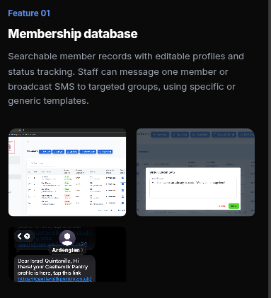
A custom image lightbox for project screenshots, built on the
native <dialog> element with hand-written
open/close/next/prev logic — the same pattern reused across
the case study pages on this site — instead of pulling in a
gallery library.
Responsive CSS grid architecture
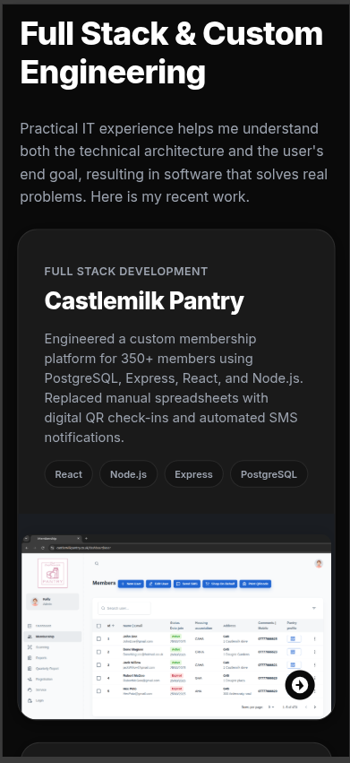
The project cards, case-study layout, and navigation are all built on hand-crafted CSS Grid and Flexbox, with no utility framework underneath — every breakpoint and spacing decision written and tuned by hand.
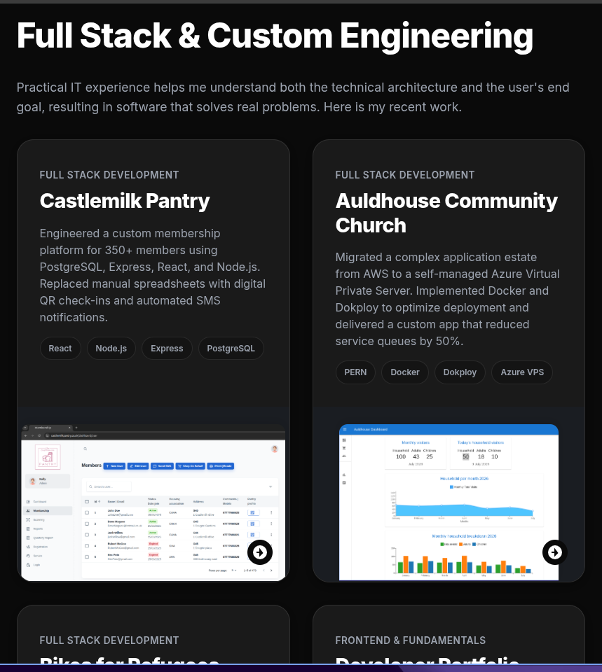
How it's built
I'm not against frameworks or libraries, my client projects lean on React and Node.js. This site was a deliberate exception, built to prove I could take full control of a website end to end without reaching for tooling to do the hard parts for me.
I held the Figma design back until client work existed to fill it with, then moved as soon as I was in a position to actively pursue full-stack roles. Speed mattered more than perfection at that point a live, imperfect portfolio beats a polished one still sitting in a design file.
With no component system to lean on, every repeated piece of UI cards, tags, buttons, is hand-duplicated across the markup. I kept the site intentionally simple in scope specifically so that repetition stayed manageable rather than becoming unmanageable.
What changed
Built in a two-week sprint after getting permission to work in the UK, this site turned a dormant Figma file into the live home for every case study on this domain including this one.
What I'd do differently
Building this took me for a ride into complexity I don't usually see in client work, repeating the same markup over and over with no components to reach for. It made me rethink, honestly, why we use frameworks in the first place, and gave me a real appreciation for what a library like React is actually solving. Writing lightweight, dependency-free code is beautiful, and the control is real but it isn't easy, and even on a site this small, it isn't scalable. Next time I'd consider at least a lightweight templating approach for repeated components, while keeping the rest fundamentals-first. Even so, I'm glad I built it this way once it took me back to the fundamentals I first learned when I started training as a full-stack developer, and that was worth the two weeks on its own.